Gallery
This chapter will explain: what are card and gallery, as well as how to create and use them on the platform.
Card & Gallery
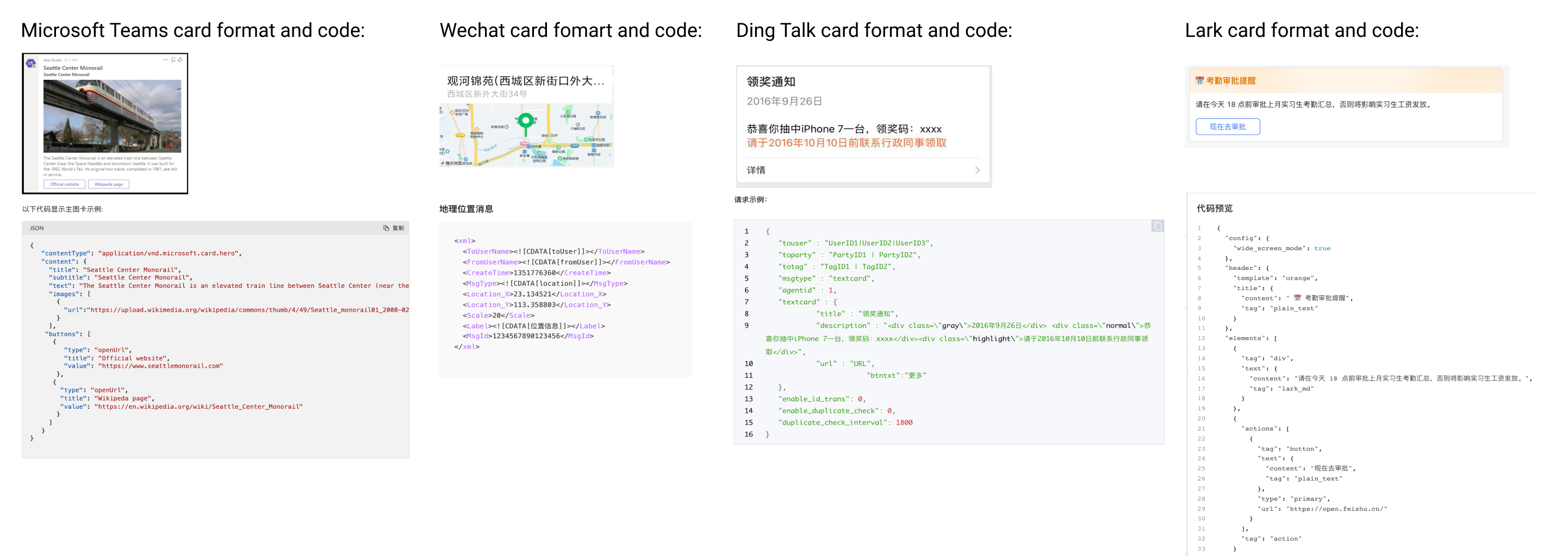
In addition to message types such as text and image messages, you may want the agent to send richer responses in conversations. For example, card messages supported on different channels:
The gallery brings together the platform preset cards and custom cards, where you can add, delete, modify and search for cards. These card templates can be used directly in agent responses. All you need to do is to modify the corresponding item values according to business. For details, see Configure response with gallery.
Preset card: Cards provided by the platform.
Custom card: Cards created by the user, which includes cards created directly on the platform, and cards imported to the platform.
Preset card
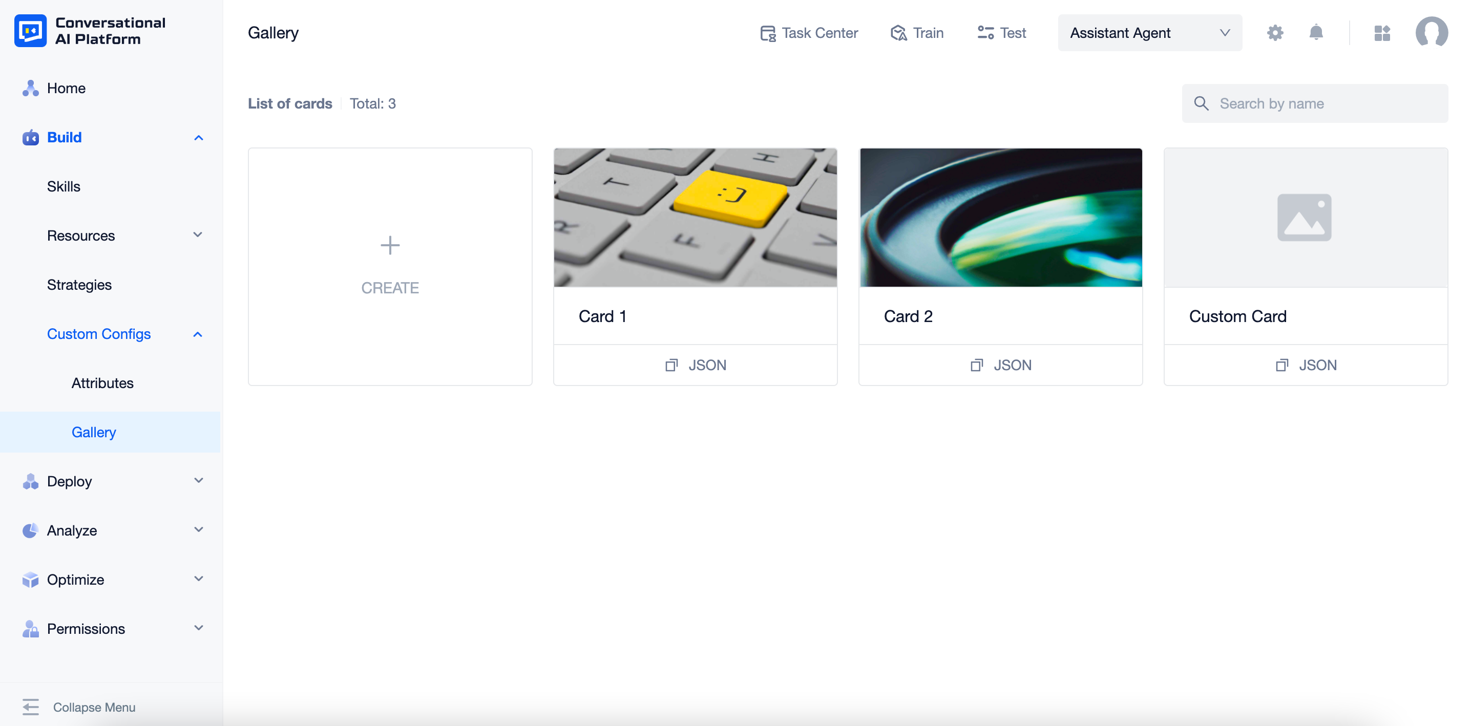
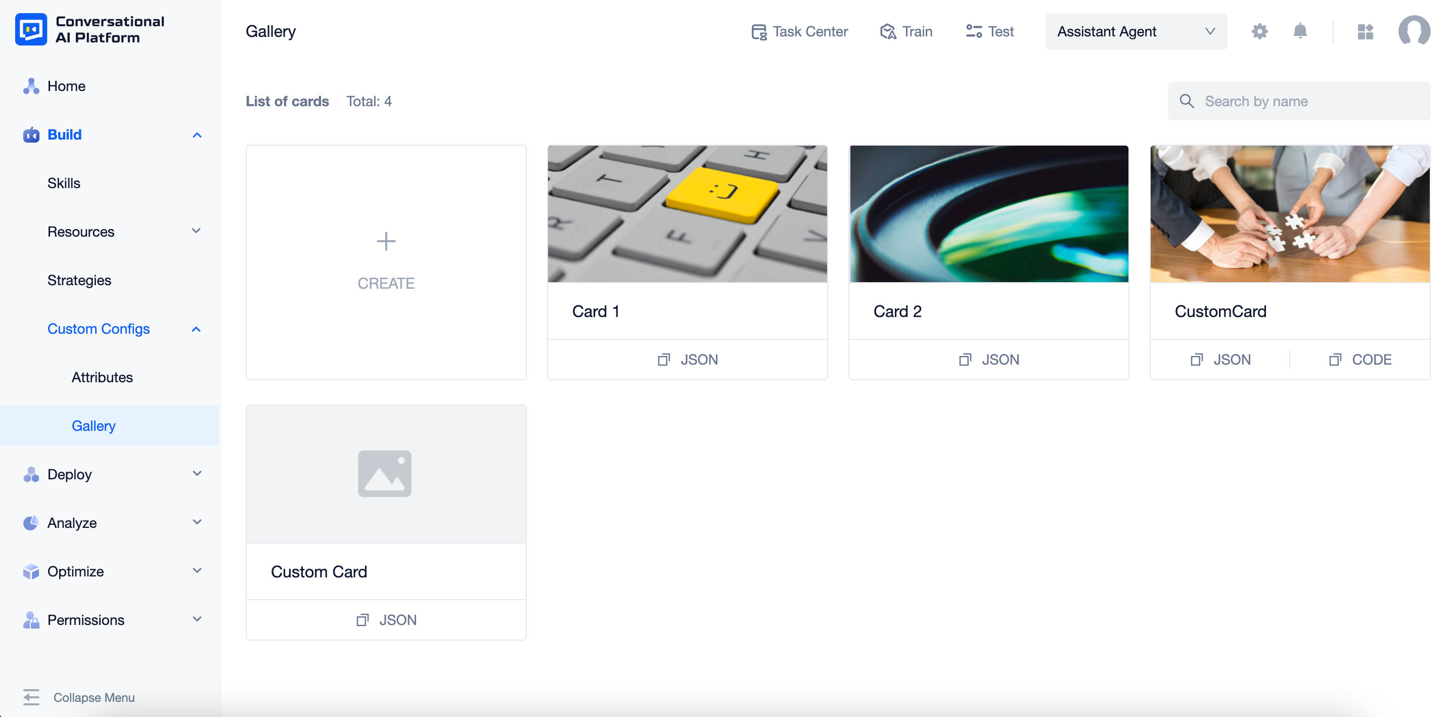
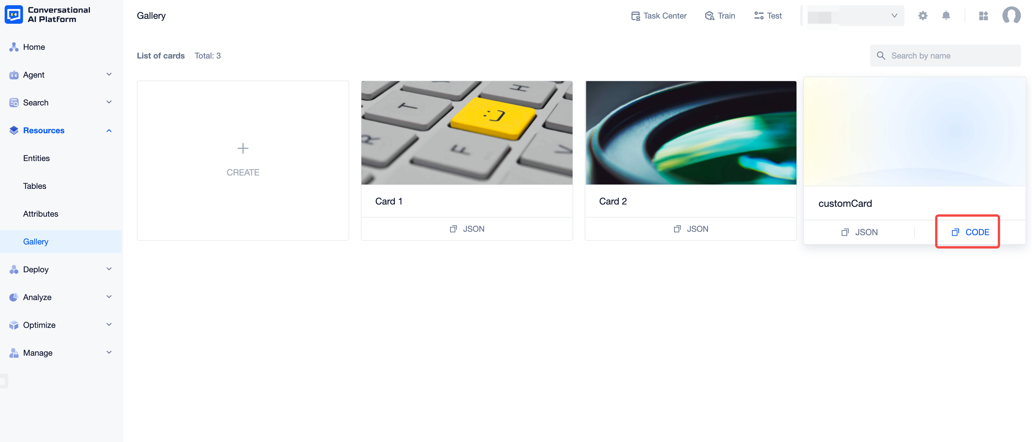
Click "Build - Custom Configs - Gallery" to enter the page. In the initial state, only the preset cards provided by the platform are displayed. Displayed items are cover, name and copy JSON button.
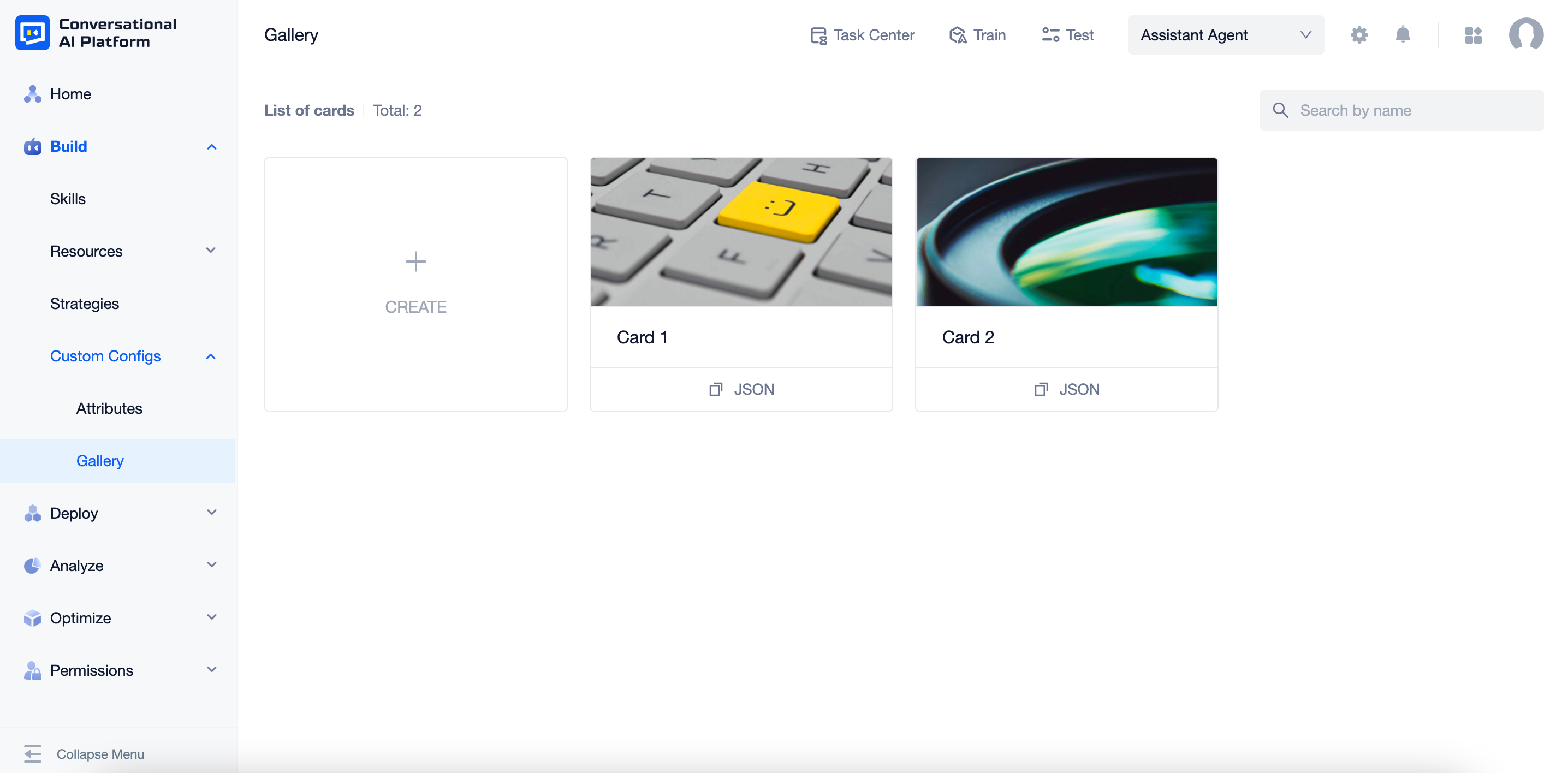
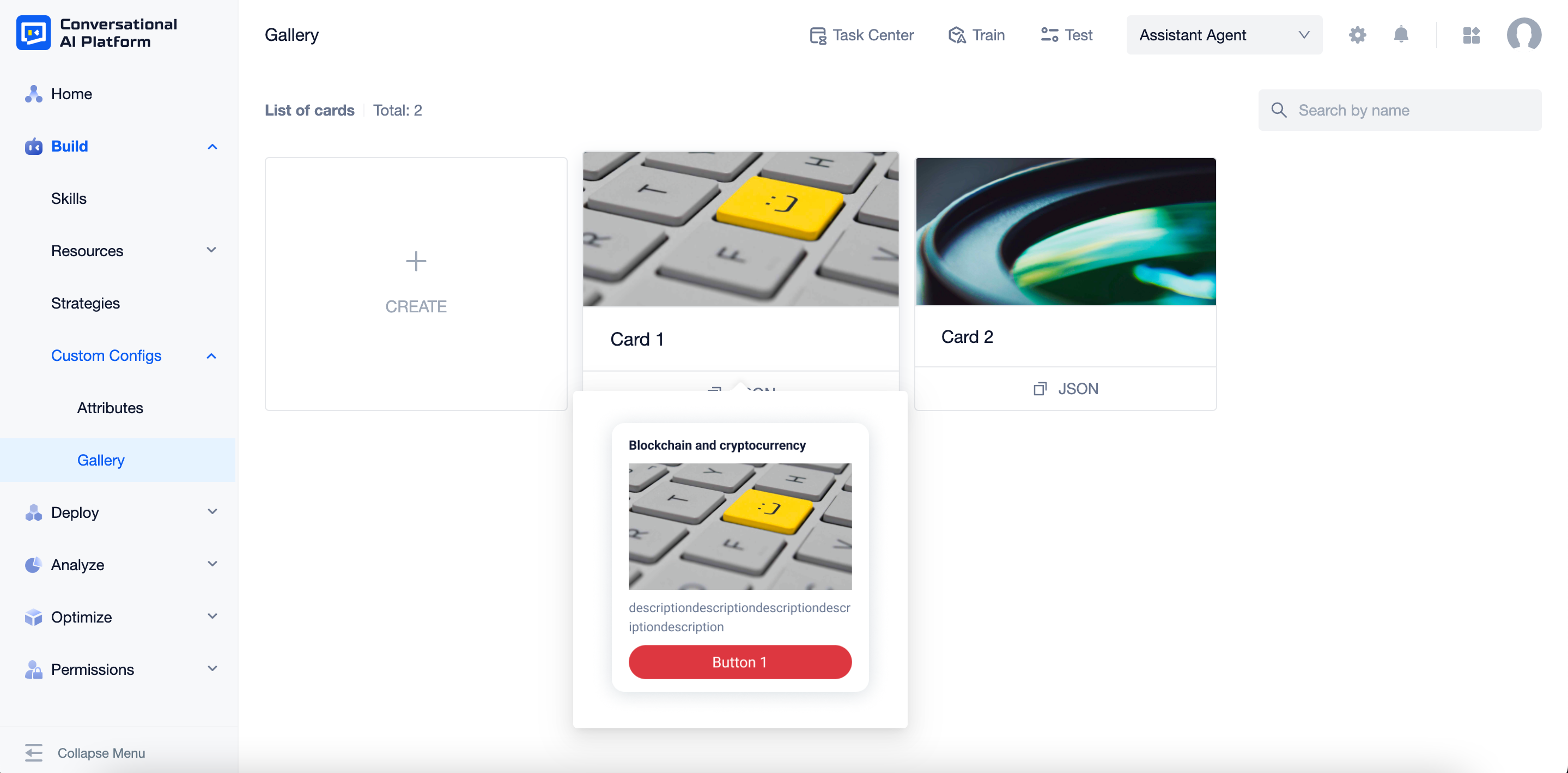
Hover over the card cover or name of the card to preview it.
Click the card cover or name to check configurations. Displayed items are name, JSON, Preview. You can click the corresponding button to copy the code or the JSON.
note
Preset cards cannot be modified or deleted.
Custom card
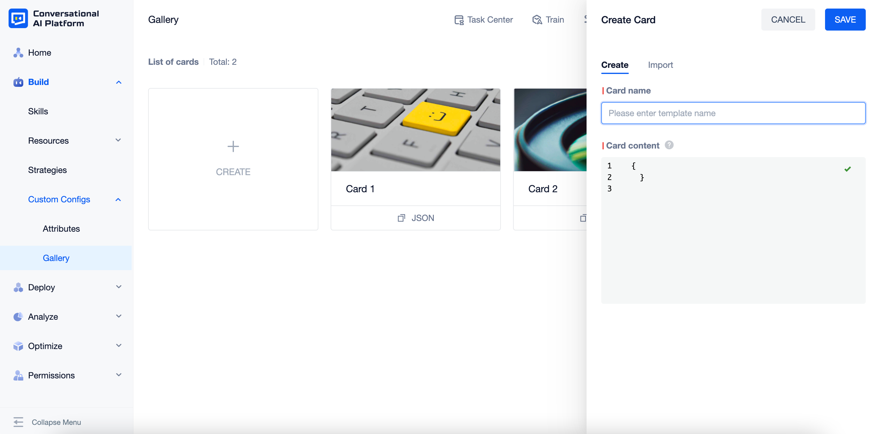
How to create a custom card
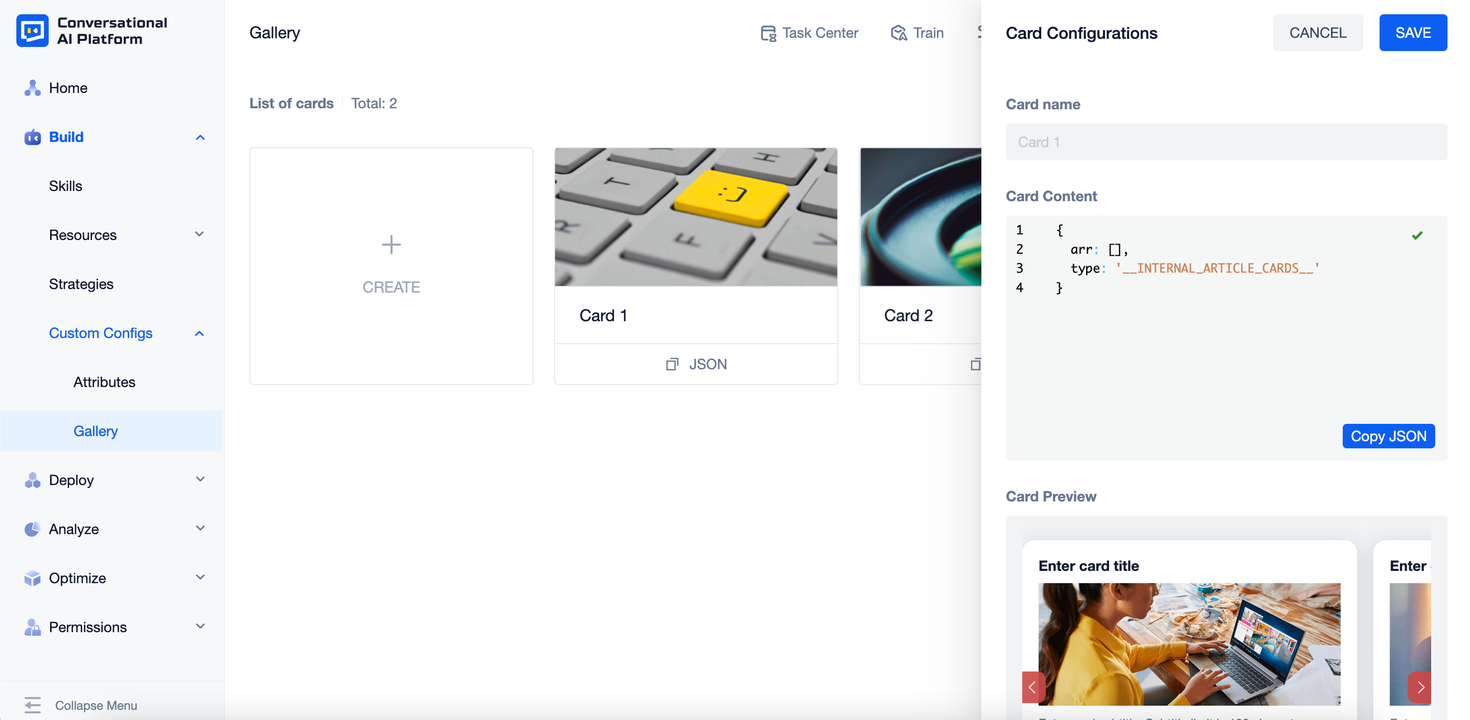
Click "+ CREATE", choose the "Create" tab, set the card name and JSON format card content.
Once created, the cards will be displayed after the preset cards in the order of creation, from last to first. Displayed items are cover, name and copy JSON button.
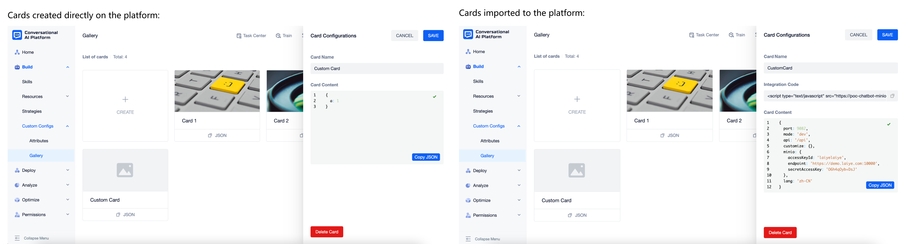
- Cards created directly on the platform will use a default image as the cover.
- Custom cards do not support hovering on the cover or name to preview.
tip
The card content must be written in JSON format. It is recommended to mark the item values that can be modified when creating for future use.
{
  content: 'CARD_NAME',
  content: 'CARD_CONTENT'
}
How to import a custom card
- Click "+ CREATE", choose the "Import" tab and upload the
.zipfile (maximum 50MB). The name of the .zip file will be used as the default name of the card, which can be modified later.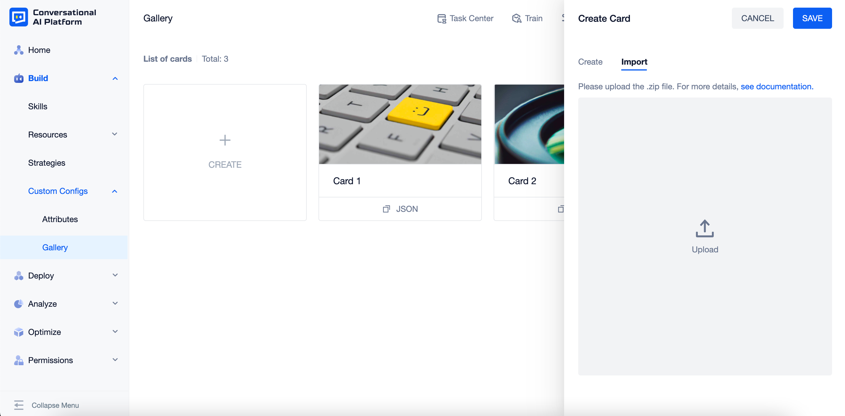
caution
Listed below are the files needed in the .zip file:
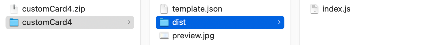
| File Name | File Format | Additional Info |
|---|---|---|
| template | .json | JSON format card content,that is, the parameters that the card component needs to receive |
| dist | Folder | index.js (i.e. card component resources) should be included in this folder, js files need to export components by default and package them in library mode |
| preview | Support .jpg, .jpeg, .png, .svg, .bmp file | (Optional) Card cover |
Please make sure the file names and formats are the same as required in the table. Otherwise, the parsing will fail.
- Once created, the cards will be displayed after the preset cards in the order of creation, from last to first. Displayed items are cover, name, copy JSON button and copy CODE button.
- If the "preview" file exists, it will be used as the card cover.
- If the "preview" file cannot be found, a default image will be used as the card cover.
- Custom cards do not support hovering on the cover or name to preview.
Configurations & Operations
- Click the card cover or name to check configurations. Displayed items are listed as below:
| Type | Displayed Item Name | Additional Info |
|---|---|---|
| Cards created directly on the platform | 1. Card Name 2. Card Content | 1. Card name can be modified 2. Card content can be modified |
| Cards imported to the platform | 1. Card Name 2. Integration code 3. Card Content | 1. Card name can be modified 2. You can click the corresponding button to copy the card code or JSON |
- Click the "Delete" button to delete the card.
note
Though the card has been deleted from gallery, the corresponding responses in skills can still work in conversations.
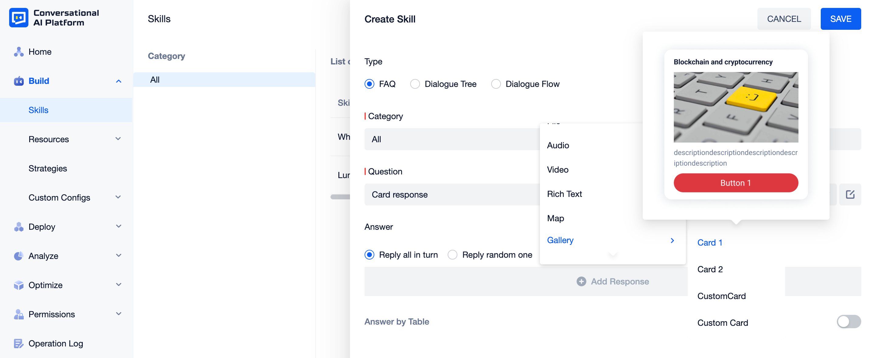
Configure response with gallery
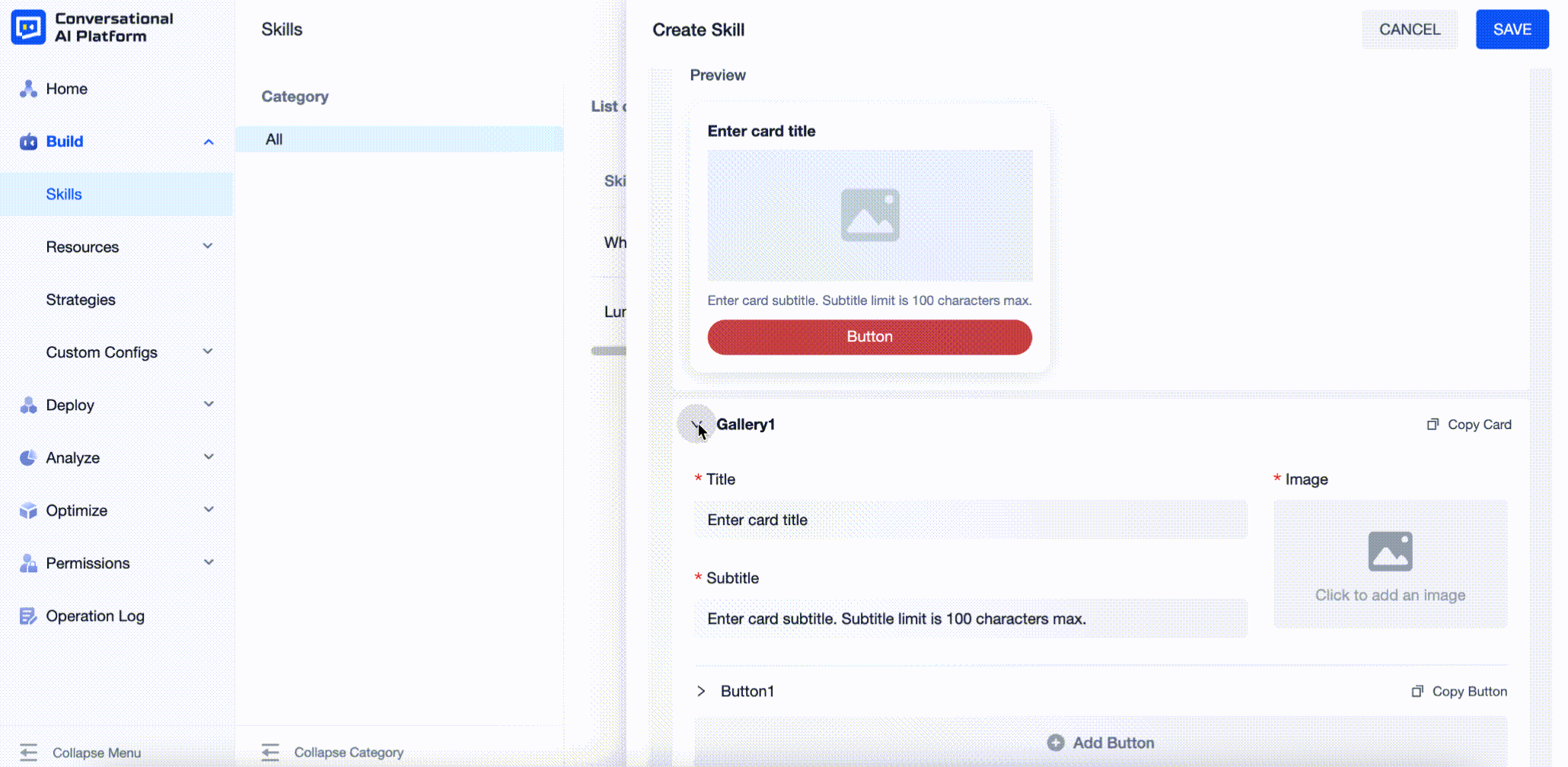
Click the "+ Add Response" button of the skill configuration drawer, all the cards added to gallery will be displayed under the "Gallery" type. For preset cards, you can hover over the name to preview it.
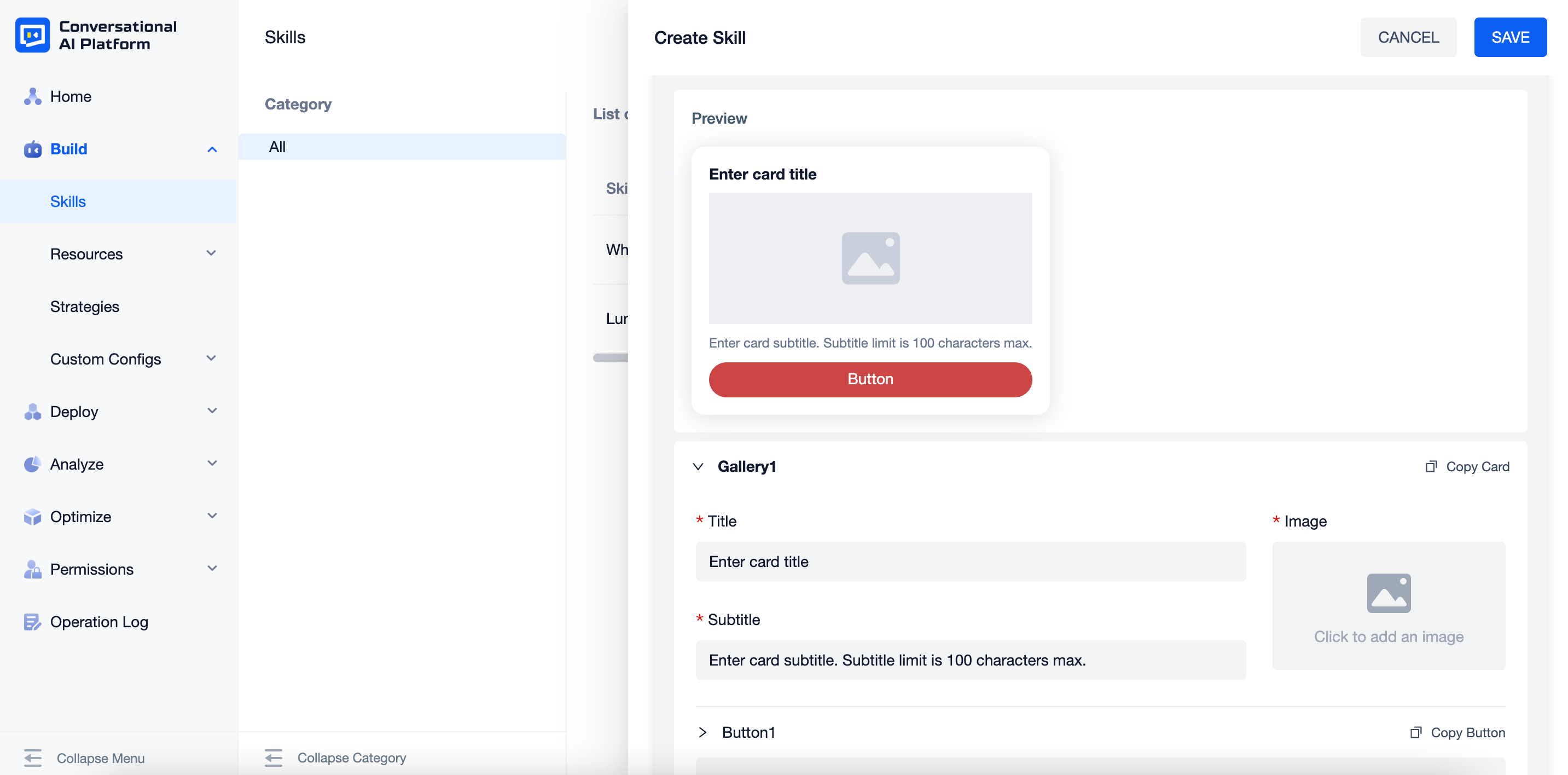
Configure response with preset card
Preset cards support visual configuration.
Operations:
| Button Name | Additional Info |
|---|---|
| Copy Card | - |
| Copy Button | - |
| Add Button | 1. Configurable for specific cards 2. Maximum 5 buttons for preset card 1 |
| Add Main Button | 1. Configurable for specific cards 2. Maximum 3 buttons for preset card 2 |
| Add SEC Button | 1. Configurable for specific cards 2. Maximum 3 buttons for preset card 2 |
| Add Card | 1. When there are multiple cards, they will be displayed as a carousel in conversations 2. Maximum 10 cards |
When there are multiple cards or buttons, you can click the icon shown in the gif to fold them for better experience。
To delete a card or a button, click "x" on the right side of the configurations.
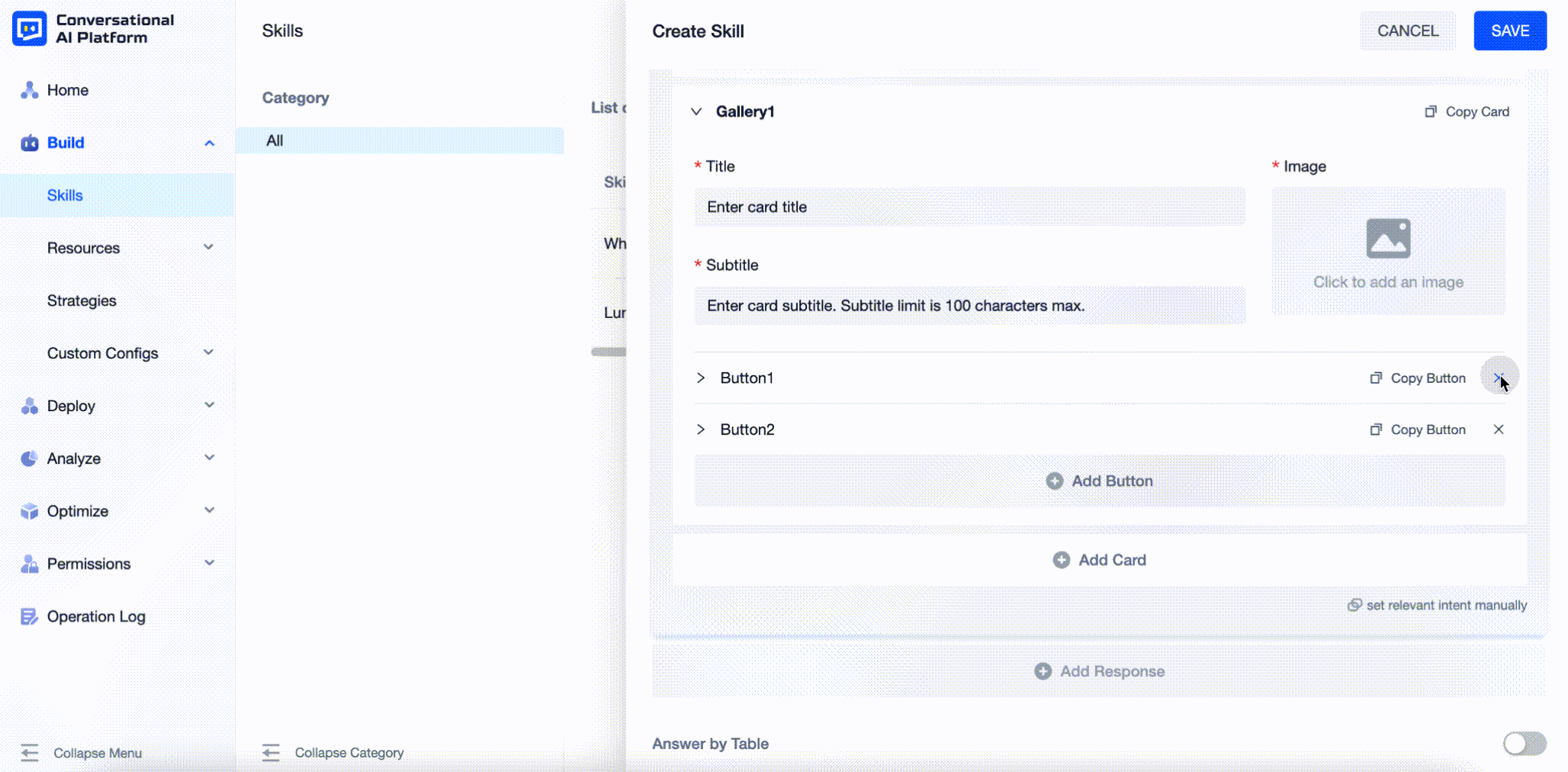
- Card configuration items:
| Item Name | Additional Info |
|---|---|
| Title | Maximum 24 characters |
| Subtitle | Maximum 100 characters |
| Image | Support .jpg, .jpeg, .png, .svg, .bmp file |
| Button Text | Configurable for specific cards, maximum 24 characters |
| Main Button Text | Configurable for specific cards, maximum 24 characters |
| SEC Button Text | Configurable for specific cards, maximum 24 characters |
| Button Color | Configurable for specific cards |
| Button Text Color | Configurable for specific cards |
| Main Button Color | Configurable for specific cards |
| Main Button Text Color | Configurable for specific cards |
| SEC Button Border Color | Configurable for specific cards |
| SEC Button Text Color | Configurable for specific cards |
| Button Type | Currently, we support two types: 1. Send message: click the button, the button text will be sent as a text message to the agent 2. Open URL: click the button, the configured URL will be opened on a new page |
| Metadata | 1. Metadata can only be used in one dialogue 2. You need to set both the key and the value |
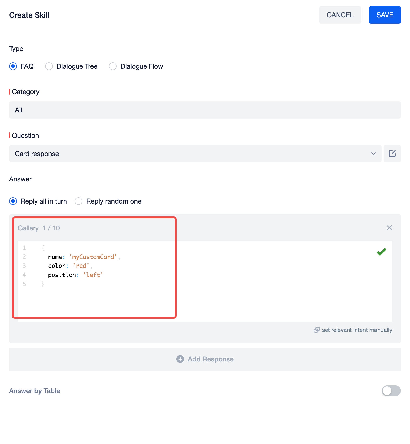
Configure response with custom card
When choosing a custom card, the corresponding JSON format card content will be displayed. You can modify the corresponding item values according to business needs.
Then copy the embed code for the corresponding card in the gallery.
Here is an example of the embed code:
<script type="module" src="myCustomCard/dist/index.js"></script>
<script type="module">
  window.chatbotWedgit.model.on('LCMessagerInitialCompleted', () => {
    window.chatbotWedgit.model.emit('LCM-registry-custom-message', {
      validator: (templateJson) => {
        /**
         * Determine whether the message matches the corresponding card based on the configured template answer format. If it returns true, the answer will be rendered with this card. For example,
         * if (templateJson.name === 'customCard') {
         *  return true
         * }
         */
        return false
      },
      component: window.myCustomCard,
    })
  })
</script>
The corresponding card component is determined in the validator method based on the content of the JSON format template corresponding to the answer configuration area. For example,
<script type="module" src="myCustomCard/dist/index.js"></script>
<script type="module">
  window.chatbotWedgit.model.on('LCMessagerInitialCompleted', () => {
    window.chatbotWedgit.model.emit('LCM-registry-custom-message', {
      validator: (templateJson) => {
        if (templateJson.name === 'myCustomCard') {
            return true
        }
        return false
      },
      component: window.myCustomCard,
    })
  })
</script>
Paste the edited embed code below the deployment code on the page where the Widget SDK has been deployed to register. For example,
<html lang="en">
  <head>
    <title>Title</title>
  </head>
  <body>
    <script>
      // Widget SDK
    </script>

    <script type="module" src="myCustomCard/dist/index.js"></script>
    <script type="module">
      window.chatbotWedgit.model.on('LCMessagerInitialCompleted', () => {
        window.chatbotWedgit.model.emit('LCM-registry-custom-message', {
          validator: (templateJson) => {
            if (templateJson.name === 'myCustomCard') {
              return true
            }
            return false
          },
          component: window.myCustomCard,
        })
      })
    </script>
  </body>
</html>
tip
Index of custom messages provided by commonly used channels
Here is a table of the agent custom message documentation provided by commonly used channels for your reference.